Hape
A playful website: boosting trust and sales
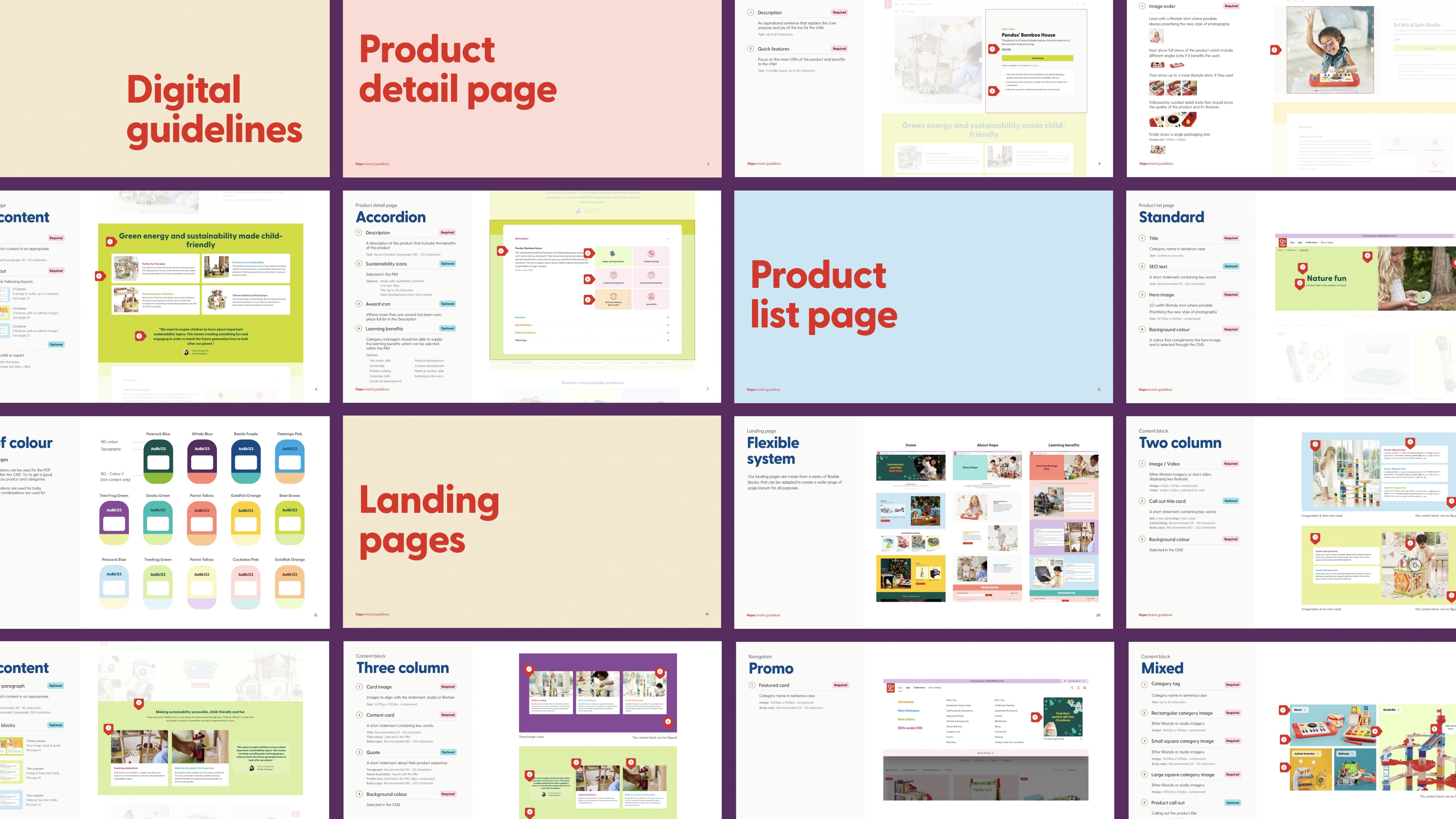
We redesigned Hape’s DTC website to build trust with parents and showcase child-centric play, delivering a refined customer journey that significantly increased engagement, returning users and sales across key markets.
The Problem
We were tasked with building a site for Hape, a previously little-known toy brand in the UK, helping shift the business to a direct to consumer model. Hape’s previous website proved detrimental to both bounce and conversion rates. Hape creates child-centric toys, and the new website needed to demonstrate this, whilst also feeling fresh and instilling trust and confidence in parents that Hape products are right for their children.
The Solution
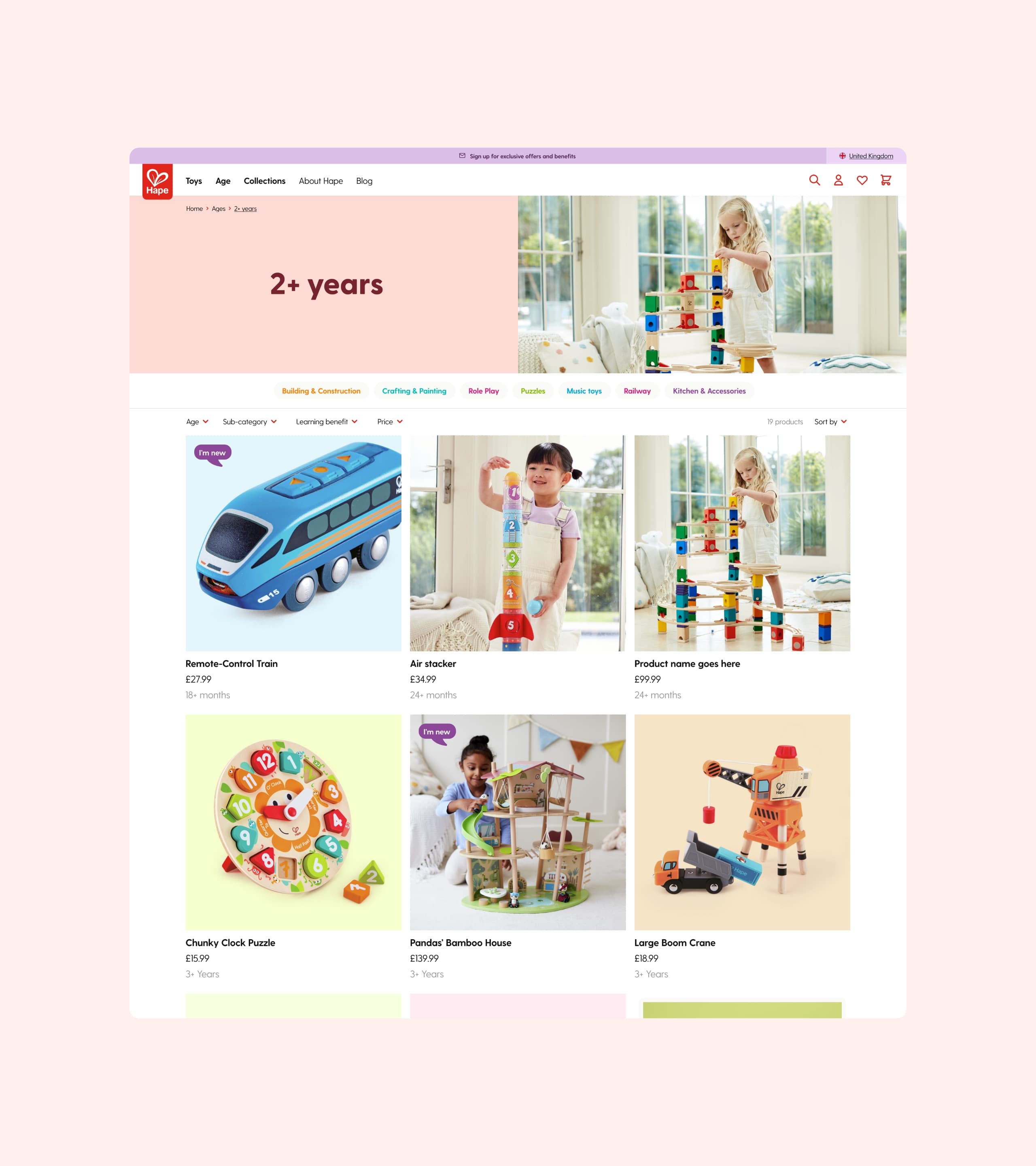
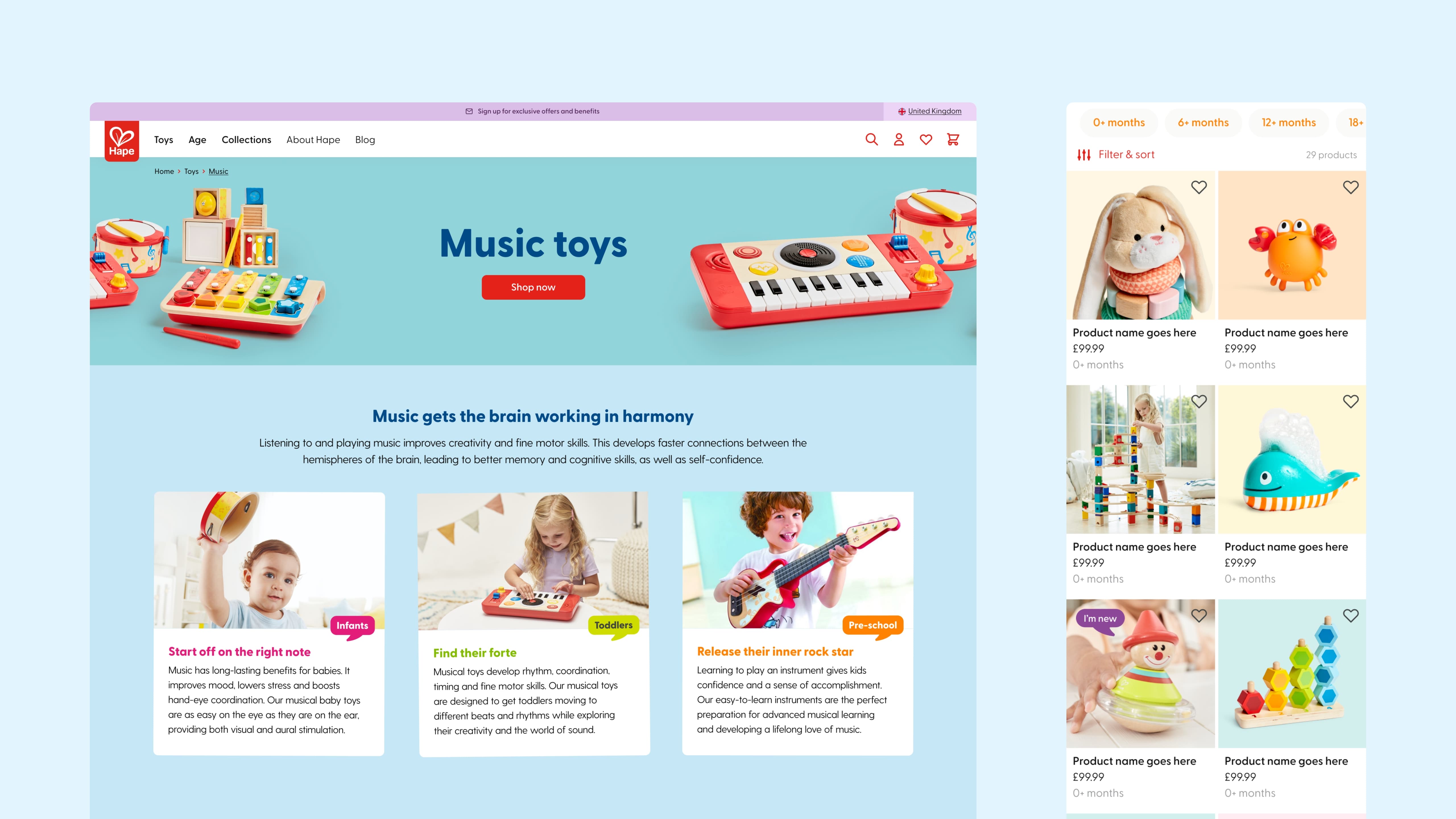
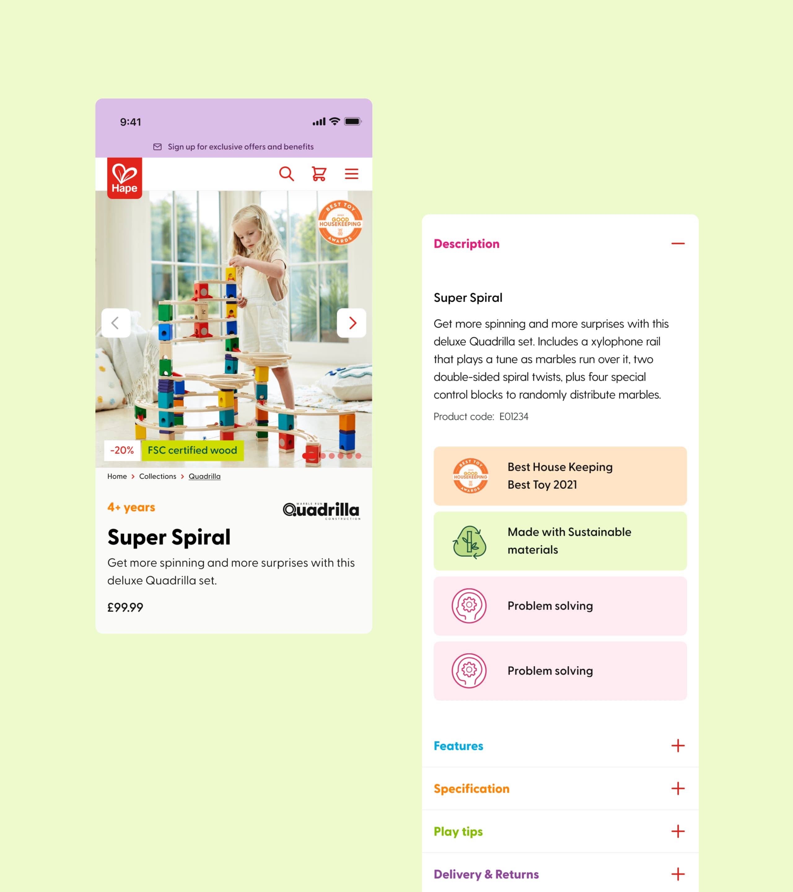
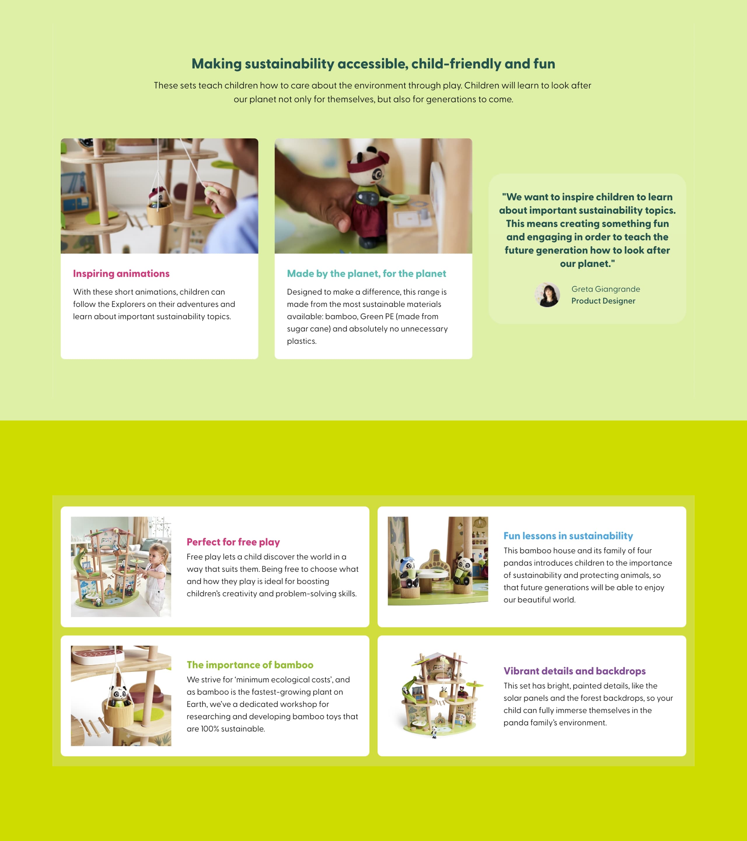
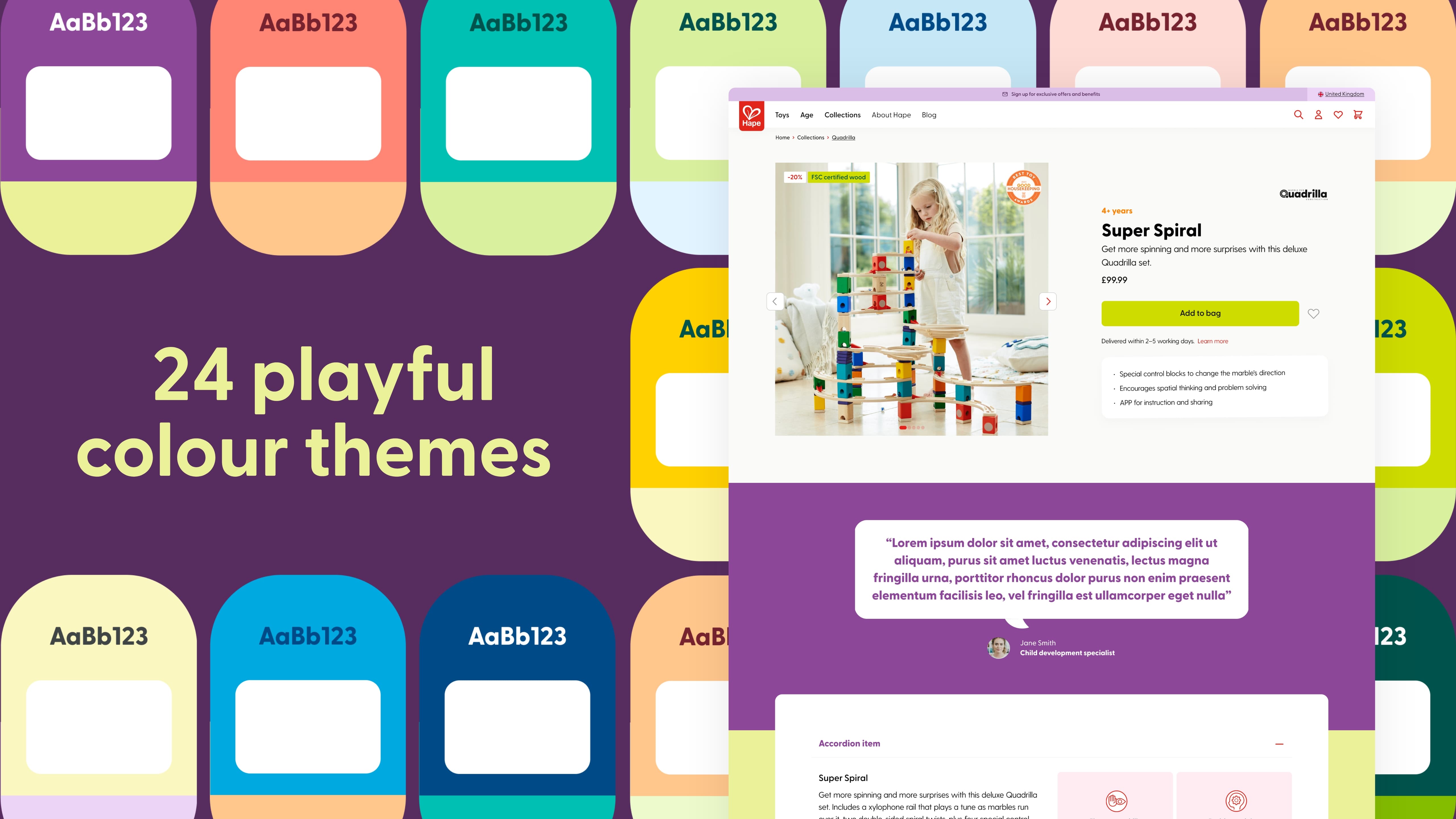
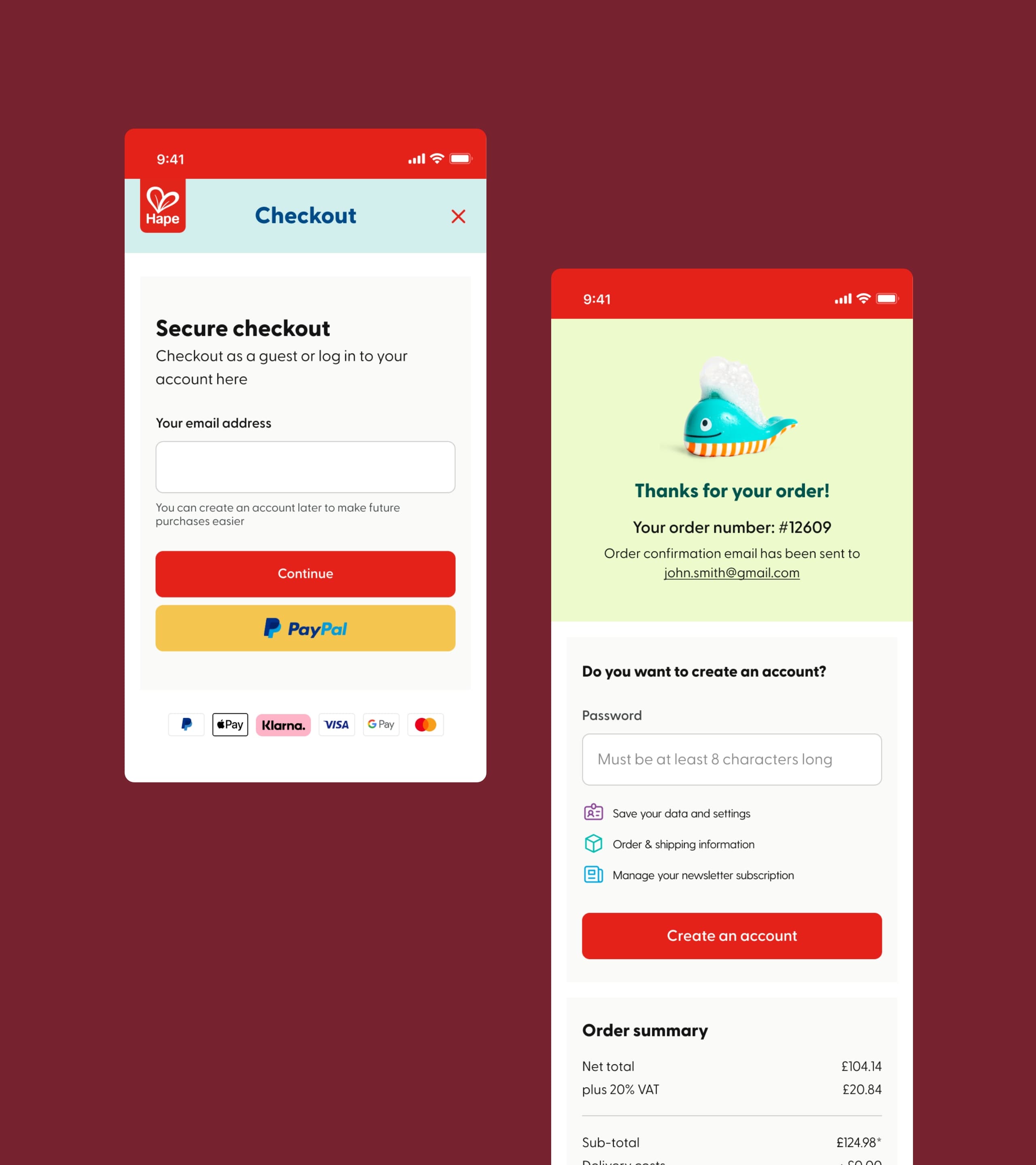
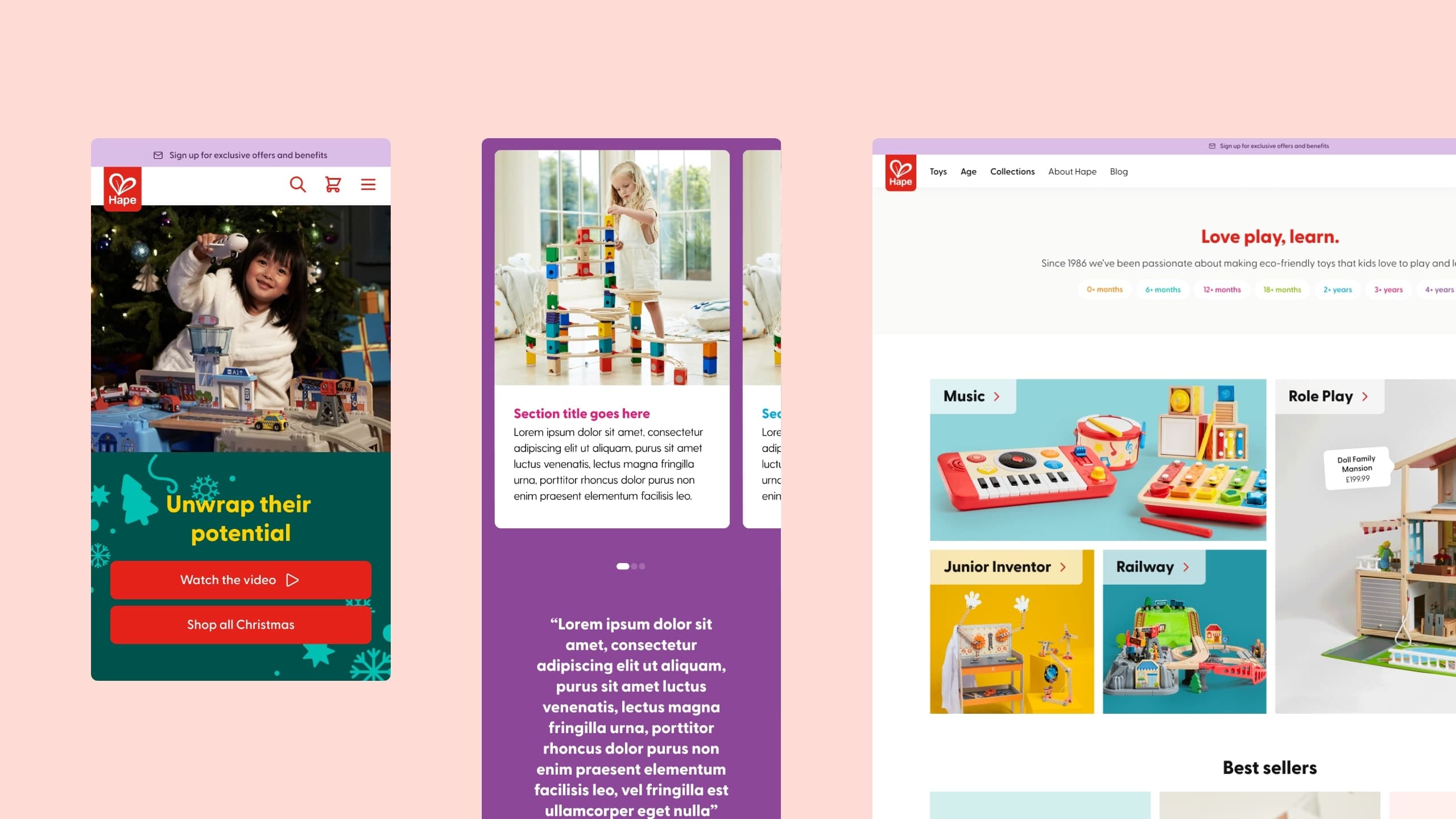
We delivered a fully responsive website that was designed specifically to highlight the toys and their benefits to the children who play with them. The customer journey was refined to ensure that the focus was on pushing customers through the funnel to final check out and optimising pages to show content in the most aspirational way.
The Result
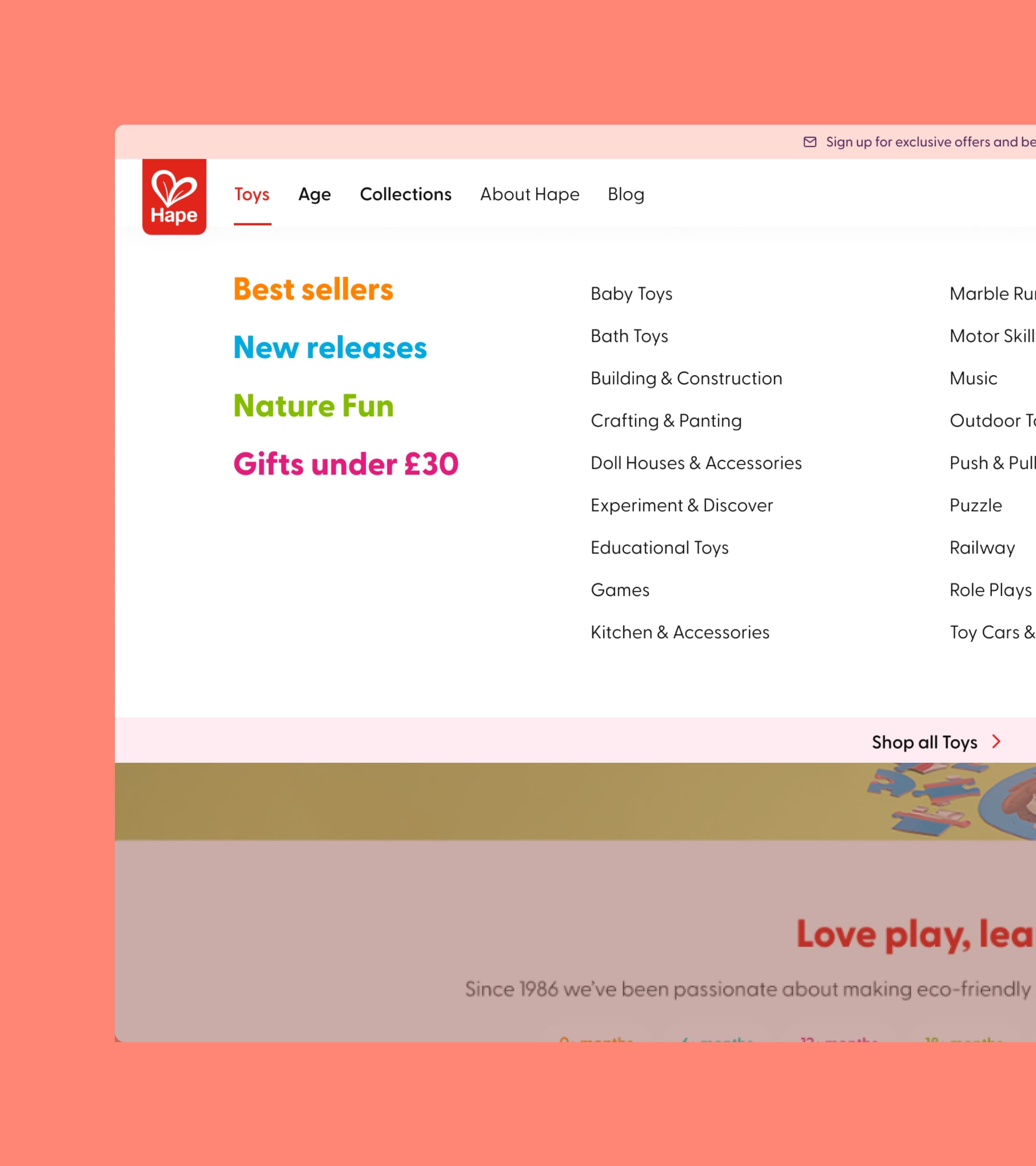
We also enhanced imagery and copy across key products, optimising the homepage to highlight Hape’s extensive range. The result is a website that effectively portrays the brand, generating positive brand awareness. Total engagement has increased, with markets experiencing 3-5x more sessions since launch and a rise in returning users. Overall, the brand’s visibility and engagement have improved, leading to a 2x sales performance boost across all markets, notably in the UK and France, reaching up to 2.5x.
Sector
Digital
