The problem
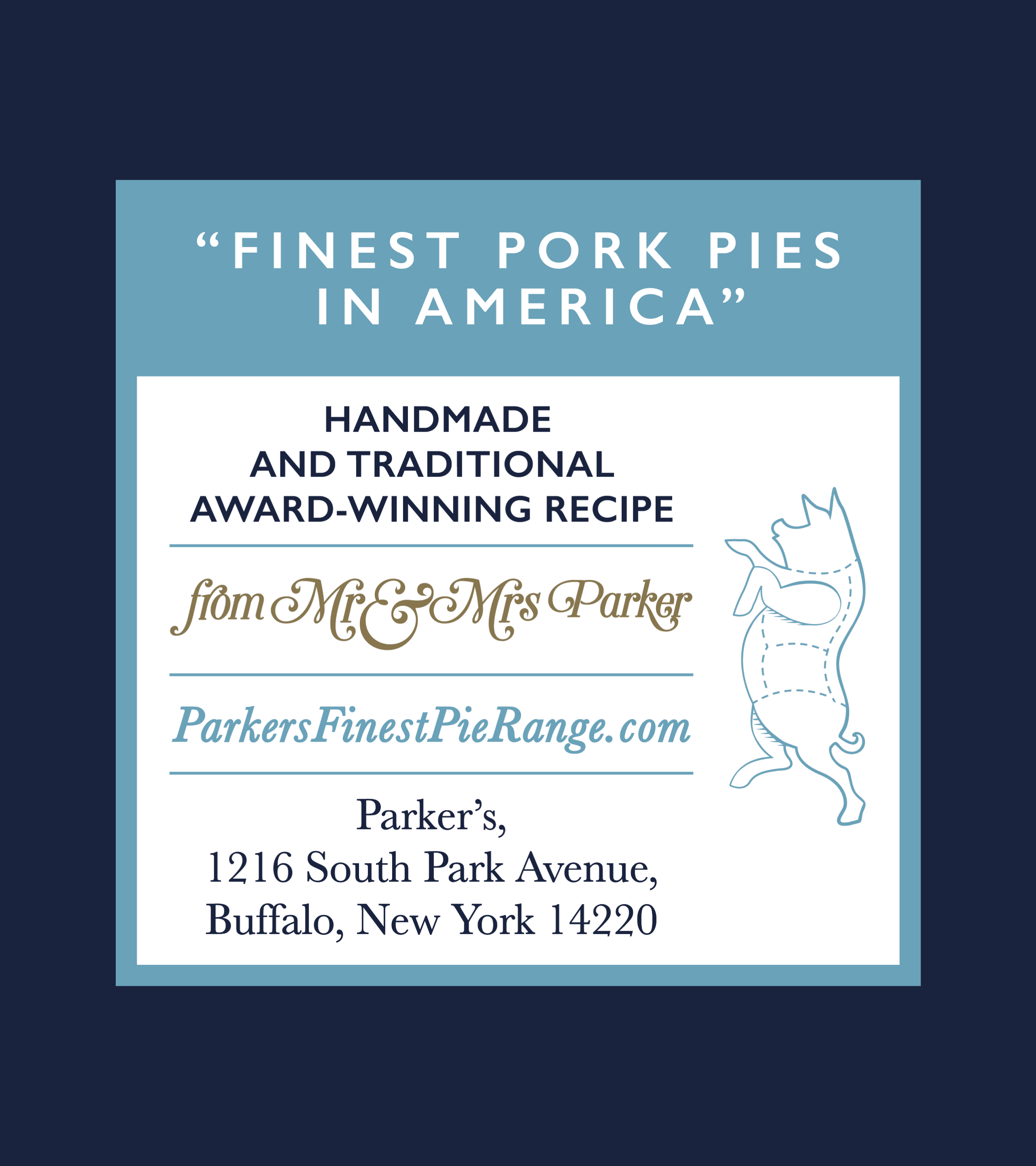
As part of the refreshed brand identity we created for Parker’s, aiming to help them break into the US market, we designed a whole suite of new packaging to keep the new branding consistent.
The solution
The packaging we created included various boxes, labels and wrapping paper, using gold foil and a colour palette that is sympathetic to the Parker’s British roots. We used traditional graphic elements to compliment the identity as well as introducing light-hearted ‘moments’ giving the brand a personal touch and injecting a bit of good old British humour.
The result
The project culminated in a collection of packaging that beautifully embodies the brand’s British heritage through its simple yet elegant design. The packaging effortlessly combines a classic and minimalist aesthetic, paying homage to Parker’s roots. This cohesive and professional packaging suite perfectly aligns with Parker’s refreshed brand identity, showcasing their commitment to quality and capturing the attention of customers.