The problem
Our client, a successful luxury skincare brand for women, recognized a market gap for premium skincare products for men. With expertise in the industry, they understood the growing demand for natural, luxury products that are gentle on the skin and eco-friendly. They approached us, seeking assistance in establishing a fitting name, a compelling brand identity, market positioning, and product packaging for their new men’s range.
The solution
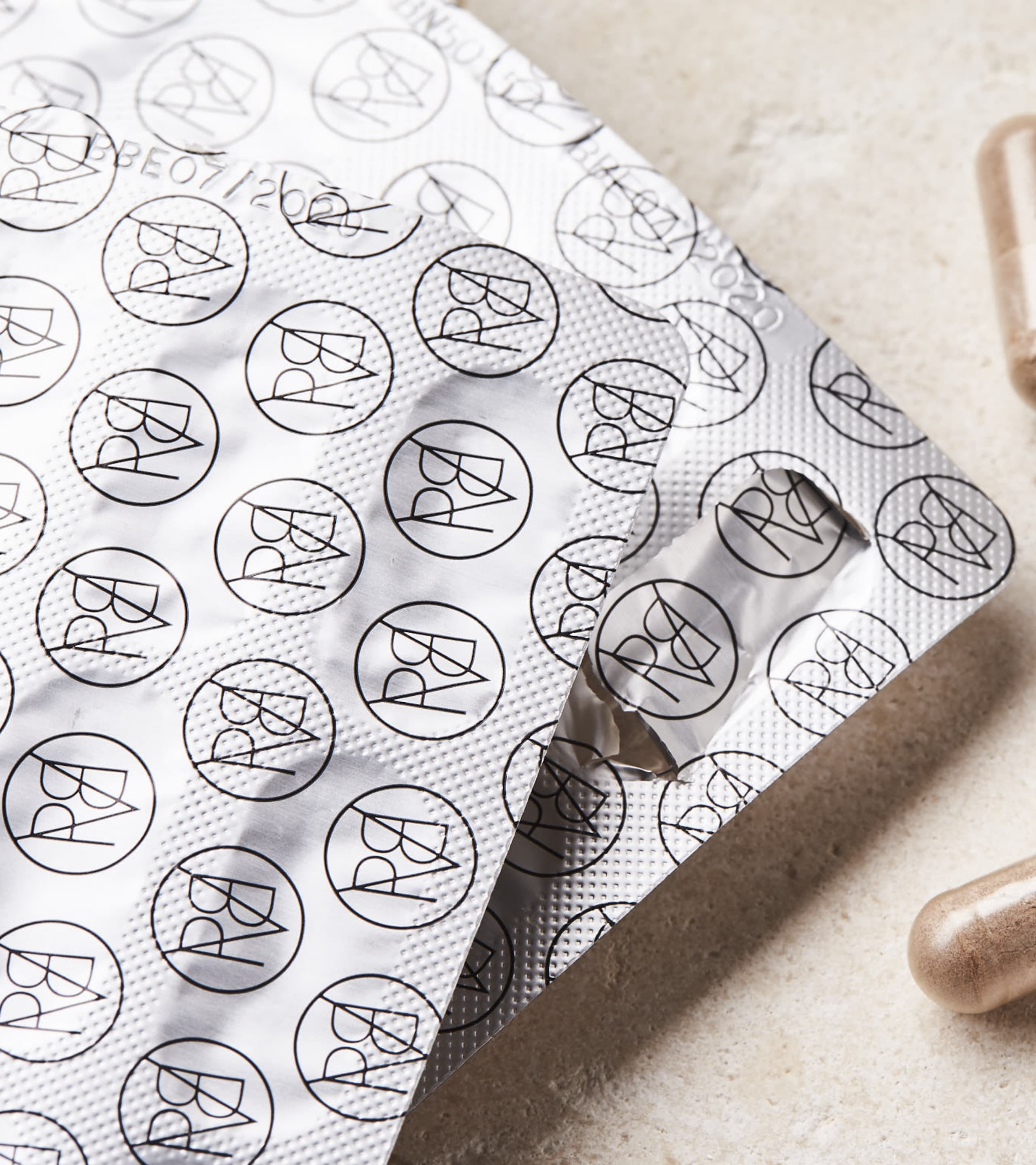
The packaging was designed with the wholeness of the identity marque and product in mind: the diagonal cross sections colliding and combining to meet in a perfect central point revealing the brand marque. The yellow flash a consistent visual cue on both the boxed and bottled products which was ownable and recognisable for all Proverb products.
The result
Launching with six individual products, we needed to ensure it was clear the range was made with the male consumer in mind, and had premium stand out on shelf. The result was sleek packaging for the product range that exudes luxury, simplicity, and conscious beauty.