Trends
Exploring Inspired Creative uses of Illustration
Lydia Wehling
19/03/24
Creative illustration’s true beauty goes beyond technique and talent, capturing intricate narratives, evoking emotions, and simplifying complex concepts into visually pleasing solutions, showcasing inspiring uses of illustration. Here are some examples that inspire us:
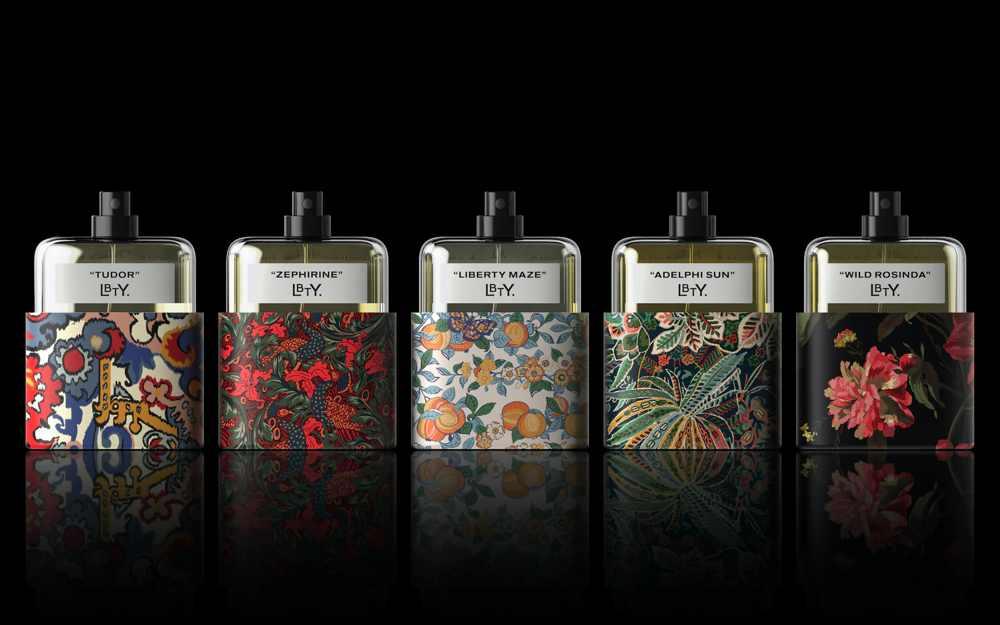
Liberty Fragrance
Designed by Pentagram, this new beauty sub-brand for Liberty showcases five gender-neutral fragrances featuring wonderfully crafted archive-inspired prints. Challenged with developing a recognisable brand design that draws from the history of Liberty Pentagram opted for a custom oversized sleave which covers most of the bottle. This maximises the printable area available for each individual Liberty print and creates a unique identity for the high-end fragrances. For example, the fragrance ‘Tudor’ is inspired by the vast textured Merchant print tapestry that is suspended from the beams in Liberty’s flagship store. Using Liberty’s vast archive of prints as inspiration celebrates the brand’s heritage and creates a visual link to its history. The combination of a simplistic bottle and vibrant traditional illustrations creates an overall sense of understated luxury and perfectly defines the sophisticated Liberty brand.
Vocation Brewery
‘Simplified and amplified’ is the work of Robot Food for Vocation Brewery. The work of Robot Food for Vocation Brewery has been described as ‘Simplified and amplified’. Moving away from their uniform black cans, this new design features bold, striking colours in a range of custom illustrations. The ‘V’ icon is now used to create a frame for the packaging illustrations, creating a strong unified approach but also allowing for enough flexibility for each individual beer to express its own personality. By creating an own-able illustration style, that showcases, each beer’s unique story incorporates previous pack elements and colours, they have managed to create an authentic and inclusive look and feel. The interaction of the ‘V’ icon and bold illustrations creates a confident and ambitious tone, giving the brand a striking, playful, and down-to-earth visual identity that stands out on the shelf.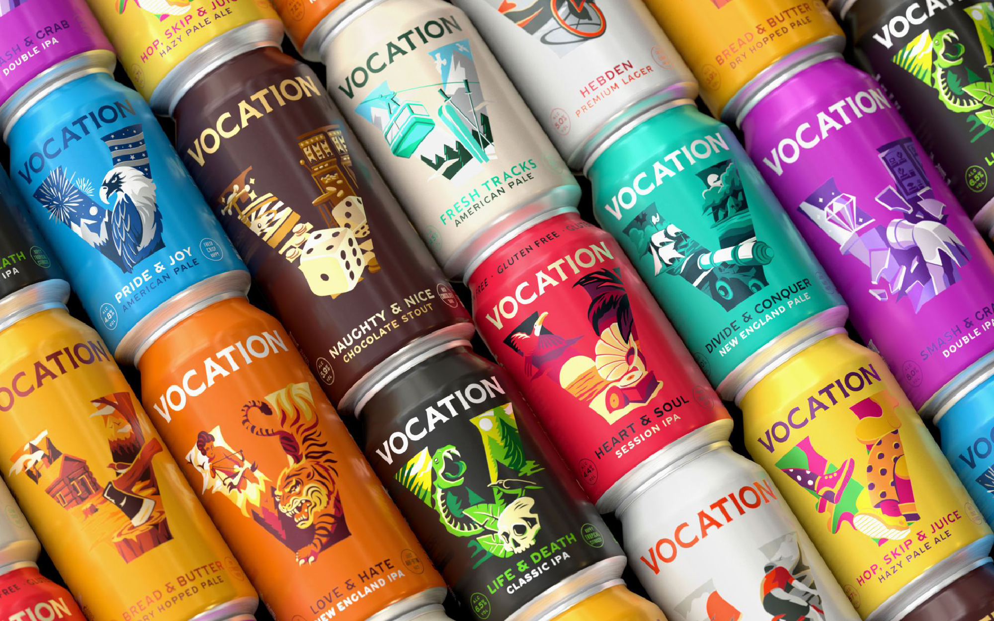
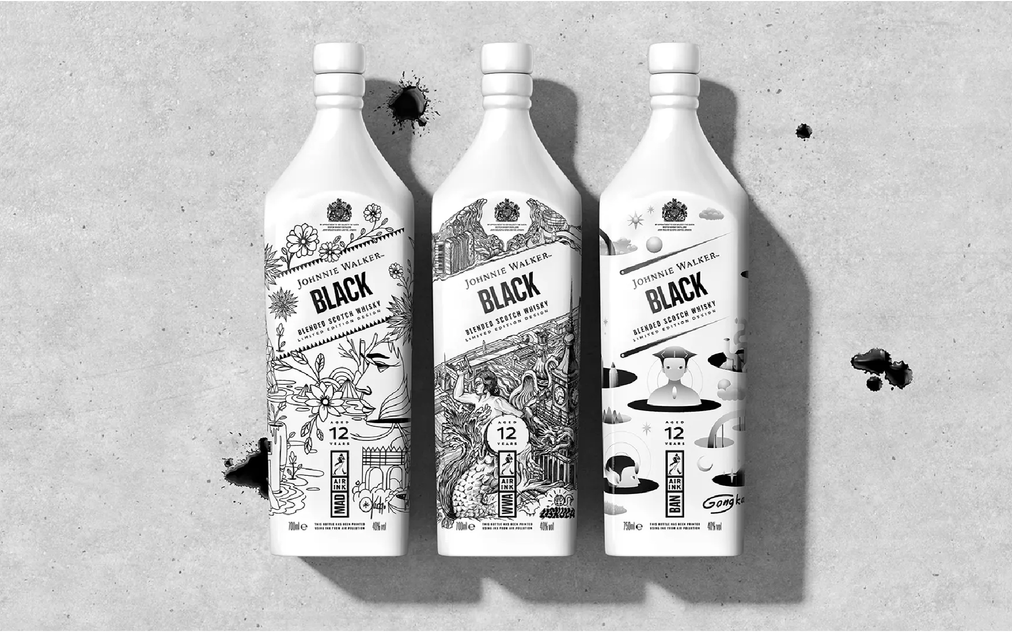
Johnnie Walker
A series of Johnnie Walker Black Label bottles named the ‘Keep Walking City Collection’ is inspired by major worldwide cities whilst aiming to connect with a new generation of whisky enthusiasts. The insight that came from Creative agency Bulletproof is that Gen Z identify more with their home city than their country. Each bottle features a bespoke illustration designed by local street artists. For example, Alex Morawski celebrates the landmarks of Warsaw, Okuda San Miguel depicts culture and nature colliding on the streets of Madrid and Gongkan’s depiction of Bangkok celebrates the next generation. Each illustration tells a story of the city, both its heritage and its contemporary culture through the artist’s visual language. Although the illustrations are unique each design is unified by the printing method; Air-Ink printed directly onto pure white bottles. This ink, derived from captured pollution, carries a strong environmental message. The combination of a unique visual identity interwoven with a strong cultural message makes the overall design incredibly successful.
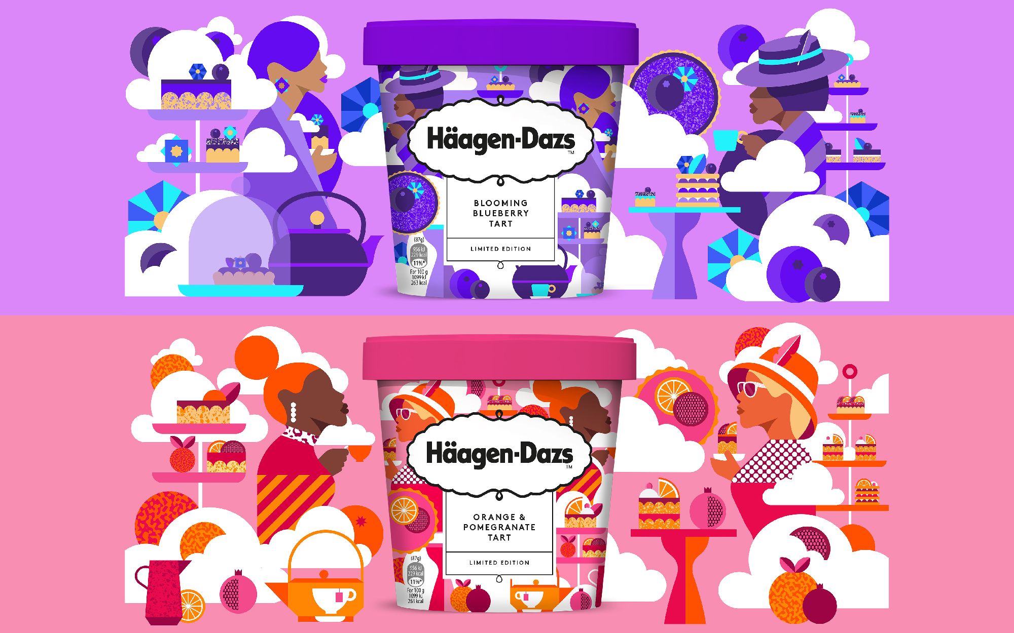
Haagen-Dazs
Inspired by afternoon tea desserts, Haagen-Dazs launched two new flavours for Spring: ‘Blooming Blueberry Tart’ and ‘Orange & Pomegranate’ featuring beautifully crafted illustrations by Eynon Jones. Despite the traditional connotations of afternoon tea, Jones brings a visually interesting twist by creating playful scenes with individually crafted elements. Paired with his use of bold, striking colours this creates high impact to vividly represent the flavours. Jones’ simple yet effective flat lay illustration style adds a unique and elegant touch, transporting customers to the delightful occasion of afternoon tea through illustrations bursting with flavour and style.
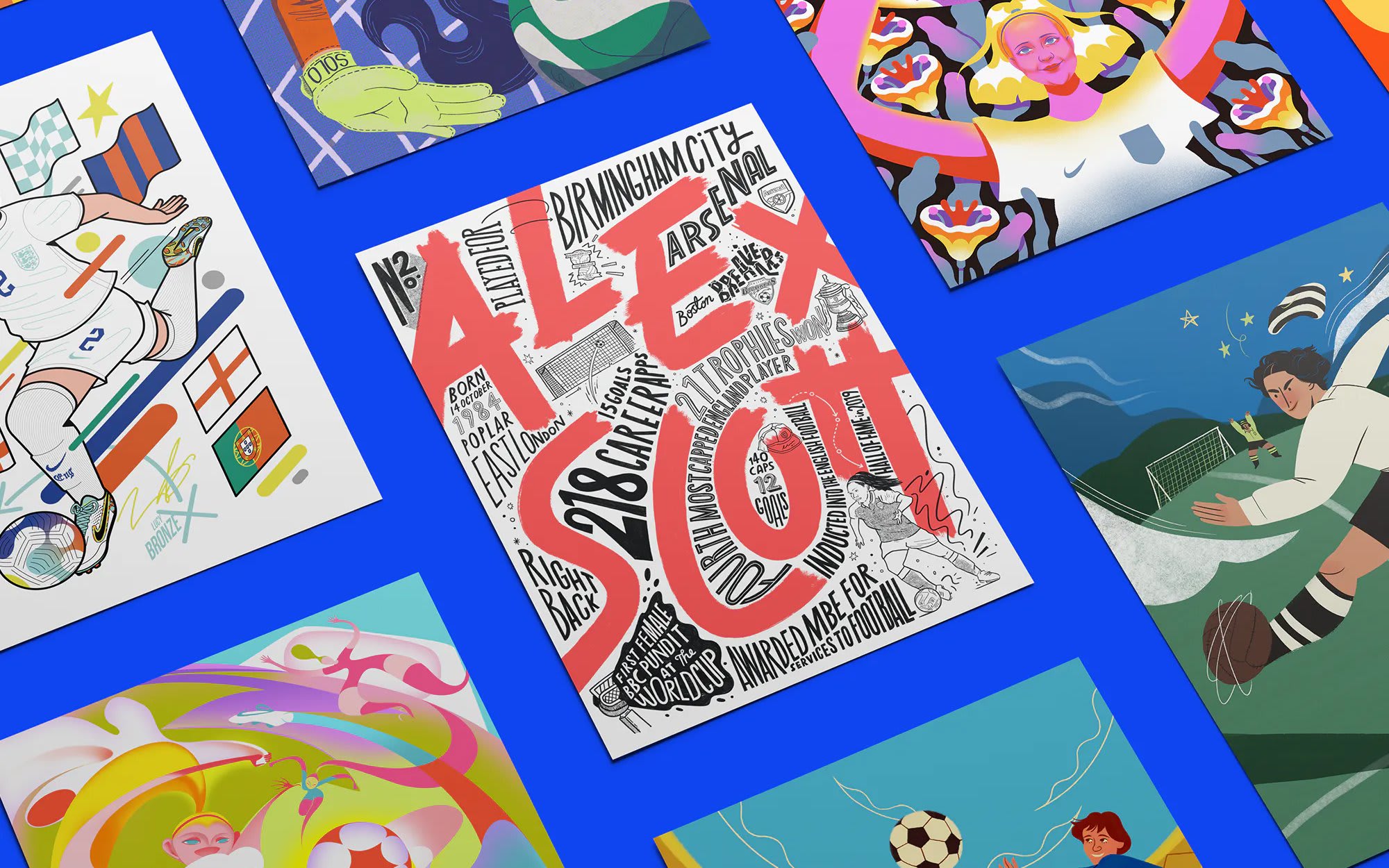
Forward Play!
On the back of England’s Lionesses historic Victory at the 2022 UEFA Women’s Euros, art director Eve Warren spearheaded an illustrative project to inspire the next generation of girls to take up football. Thirty-three extraordinary illustrators were tasked with creating a piece of artwork that brought to life a trailblazing figure in women’s football. The diverse range of illustration styles creates a striking ‘posterzine’ and online platform to spread the story. It is inspiring to see these design and illustration used to get people talking about worldwide challenges and raise money for charities that help to make a change. Not only is this project about football but creativity too.

Conclusion
Illustration plays a pivotal role in design, offering a multitude of benefits that enhance the overall aesthetic and communicative power of visual composition. The unique and customisable nature of illustration allows designers to infuse a project with creativity, personality and originality that can help to convey complex ideas in simplified and engaging ways that make information more accessible. Providing a versatile means of storytelling, to evoke emotions, convey narratives and establish a memorable brand.