The problem
TK Maxx is the home of “Big Labels + Small Prices” but as the UK fashion retail market has evolved rapidly, they asked us to help re-position the brand at retail and provide them with a new graphic kit of parts that will enable them to continue to grow.
The solution
Looking at competitors, their customers purchasing patterns and feelings towards the brand we understood that we needed to find a way to tell the whole TK Maxx brand story in a more engaging way. Our approach was to bring to life TK Maxx’s unique buying model, and the fact that customers never know what gems they will uncover, whilst being “More Proud, Less Loud” in the way we deliver those messages.
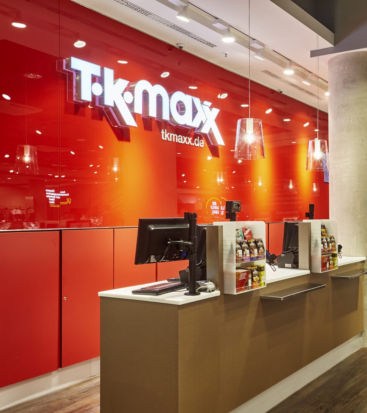
We created a new communication and in-store branding strategy for TK Maxx, the home of ‘Big Labels + Small Prices”. A new messaging hierarchy was developed along with a new colour rational with the volume of red both in the communications and store architecture decreasing to allow more style and quality messages to come to the fore. This process led us to crafting a bespoke and open typeface, created specifically for the brand. The new typeface ‘Robin Hand’ is used expressively across all internal and campaign-based communication.
The result
The first store featuring the new work opened in Munich and was rolled out globally.

